

 accesses since April 2, 1996
 copyright notice
accesses since April 2, 1996
copyright notice
accesses since April 2, 1996
Cyberspace is a successful blending of art and technology. In 1993 cyberspace was mostly technology with a little art mixed in. In 1994, it was art and technology in equal parts. From 1995 on, cyberspace will be mostly art with some technology added for stability.
Early cybernauts were preoccupied with the technology aspects of cyberspace. The first big challenge in computing is always to see if someone can get something to work at all. Later, we refine things to get it to work well. As the technology matures, we focus almost entirely on making it useful. This is also true of the evolution of cyberspace.
Now that cyberspace offers us all sorts of multimedia (albeit with some bandwidth constraints), we are starting to think of how we can use cyberspace to solve problems and support commerce. This concern inevitably leads to the artistic aspects. We know how to advertise with the WEB. Now we want our ads to be just a bit more colorful and glitzy than our competitors. If others offer dazzling graphics, then we want to offer dazzling animations. If others have narrative sound bites, then we want full orchestrations with voice-overs. You get the idea.
This inevitably leads us to design philosophies and style issues as they relate to cyberspace. As I've said before, the state-of- the-art part of cyberspace as of 1995 is the World Wide Web or, simply, the WEB.
WEB technology will survive if it meet the needs of the user community, and fail otherwise. Using a brand new client-server feature is pointless unless it helps some user do something important.
Nothing changes more than the WEB. Today's servers are tomorrows broken links. Assume that everything around your cyberspheres will change: directory structures, servers, network connectivity, links to other resources, etc., and plan accordingly.
A WEB philosophy is your vision of your cyberworld should be. How do you want to handle decision points? How should you break up large amounts of text. Should you orient yourself toward the smaller (but growing) group of technologically advanced cybernauts with modern cybermedia browsers or the much larger (but shrinking) group with text-only browsers?
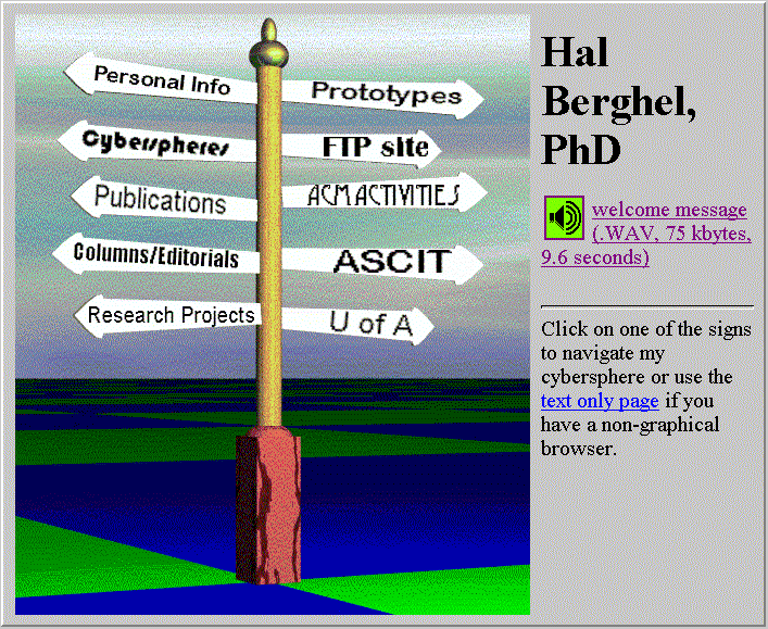
Figure 1 reveals the latest design philosophy behind my WEB homepage. I call this approach "unifying graphics" - a single image which is sensitized so that the decision points and required actions are obvious (one clicks any sign on the post for navigation). This is my statement on the way things should be - not right. Not wrong. Just mine.
I didn't always have this philosophy. I had originally used a technique which I called "rich icons" for decision points (see my old homepage at http://acm.org/~hlb/homepage.bak). I tried to capture the "sense" of a linked cybersphere with an image that conveyed that sense. Regrettably, this concept didn't scale well as my homepage evolved and had to be abandoned. Not all philosophies are created equal - even if they are all our own.
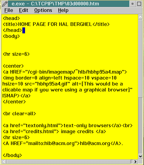 Figure 1 is a typical web home page - in fact, my own. It
consists of a "sensitized image" which is divided into regions
which are selectable by mouse click. In this case, the
sensitized regions are the signs on the signpost. Each sign
corresponds to another of my cyberspheres, which have their own
homepages, and so forth.
Figure 1 is a typical web home page - in fact, my own. It
consists of a "sensitized image" which is divided into regions
which are selectable by mouse click. In this case, the
sensitized regions are the signs on the signpost. Each sign
corresponds to another of my cyberspheres, which have their own
homepages, and so forth.
What distinguishes WEB documents which look like Figure 1 is the fact that everything centers around the unifying graphic. There isn't a mixture of graphics and text, then more graphics, then audio links, as in other approaches. Everything is unified in a single graphic. That's the hook behind this design philosophy.
Figure 2 shows the underlying HTML document which allows this to
happen. The WEB document consists of a "head" and a "body." In
this case, the head is simply the title "HOME PAGE FOR HAL
BERGHEL." The body consists of a single entity: the sensitized,
unifying graphic which is the file
While there's a lot of detail work involved in HTML editing, the
basic idea is to create a "script" which the WEB client will
interpret correctly. The whole idea is elegant in its
simplicity.
We'll take up some of the detail in a future installment. Stay
tuned.
Turn your phone number into a phrase...
http://www.soc.qc.edu/phonetic
The world's greatest insect recipes
http://www.public.iastate.edu/%7eentomology/InsectsAsFood.html
(my personal favorite is the rootworm beetle dip)
One of the Web's finer search tools, the World Wide Web Worm.
http://www.cs.colorado.edu/home/mcbryan/WWWW.html
This "worm" ferrets out information on the Web based on keyword
searches of indices and documents provided by the user.
BERGHEL'S URL PEARLS: